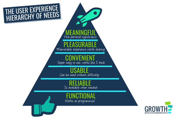
In 1943, Abraham Maslow wrote a paper called “A Theory of Human Motivation”. In it he categorised basic human needs, from physiological needs all the way up to self-actualisation. The user experience (UX) hierarchy of needs borrows from Maslow’s hierarchy in a similar way. It outlines the basic requirements that a system should meet if it’s going to satisfy the user.

Have a look at this pyramid. Much like Maslow’s hierarchy of needs, the most fundamental needs are at the bottom of the pyramid. At the peak of the user experience hierarchy of needs, we find meaning, the thing that separates a functional system from a truly transformative one.
“What’s that got to do with online learning?” I hear you cry.
It shouldn’t be news to anyone that learner engagement is the biggest challenge in L&D. The problem becomes a thousand times worse when the learners are forced to use clunky, ugly, unintuitive learning management systems.
At a time when training is becoming more important than ever before, a smooth UX isn’t just a ‘nice-to-have’ – it’s an absolute necessity. With the UX hierarchy of needs, learning platform developers have a tidy framework at their disposal. This helps guide their development roadmap and turn a functional platform into an LMS that transforms organisational culture.
Let’s see what that journey looks like:
1. Functional
At the base of our pyramid, this is the foundation that supports everything else. If the LMS doesn’t work, it’s not going to change anyone’s life any time soon. Although that seems like an obvious point, it’s no less important.
As technology moves forward, LMS providers need to keep their learning platforms up to date. For example, if an LMS was built in Flash several years ago, it might have looked like the bee’s knees back then – but now it’s essentially obsolete.
2. Reliable
It’s not enough for a learning management system to work sometimes. Training managers and learners alike rely on the LMS to work as expected whenever they need it to. If an intermittent bug means that somebody struggles to log on, they could always try again later.
There’s every possibility, however, that they won’t give the system another chance. This means that they miss out on their training and the company suffers as a result.
3. Usable
People often interpret user experience as usability and that’s a fair definition. The job of a user experience professional is to find and remove the barriers that get between the user and the system’s purpose.
Again, technological advances come into play here. Five years ago, a training manager could reasonably assume that the learners would access their content on a desktop. Nowadays, people spend more of their time using mobile devices.
Even though it’s still possible to create a desktop-only training solution, it’s a strategy that ignores the user’s behaviour. Making the system usable, means adapting it to accommodate the user – not forcing the user to change their habits.
4. Convenient
When a system is usable, you can use it comfortably. When it’s convenient, you can use it without even thinking about it. In the context of a learning management system, convenience means as much to the system administrators as the learners.
Integrations between existing systems help to lighten their workload and automate repetitive tasks. This gives the admins more time to focus on creating a better experience for the learners.
As far as the learner is concerned, a more convenient learning platform lets them engage more easily with each other. If they can easily share their knowledge and join in discussions, they can keep learning outside of the formal learning structure.
On the other hand, the slightest inconvenience might prevent them from voluntarily engaging with the system at all.
5. Pleasurable

It’s not that long ago that pleasure and learning were considered separate things. Now, it’s becoming more apparent that people learn more effectively when they enjoy the experience.
This fact has spurred the development of learning management systems in exciting ways. Techniques like gamification appeal to basic human urges and they can have a profound impact on engagement.
In a gamified learning platform, learners can earn virtual badges for completing content, passing tests and even just logging on. If the system is designed to recognise the learners’ efforts, there’s more of an impetus for them to keep using it.
6. Meaningful
In many applications, meaning can be overlooked without much impact on the user experience. For example, a calculator or a barcode reader don’t have to appeal to some deeper significance – they just need to fulfil their function.
When it comes to learning management systems, the meaning is arguably the thing that separates success from failure. A meaningful learning platform needs to speak directly to each learner and show them where they fit in the wider scheme of things.
If you want to turn a good learning programme into a great learning programme, personalisation is essential. On a more practical level, a personalised system ensures that each learner receives the training they need to meet their individual needs. This helps them get to where they need to be faster.
Learning professionals across the world are growing tired of learning management systems that don’t produce results. They’re realising that it’s just not enough to create an online training directory – they need something that translates knowledge into behavioural change. The only way to do that is to engage the learners and keep them hooked.
Click the button below and find out what you need to build a true engagement engine!


