It can sometimes be surprising how important the little things are; things you don’t often think about or consider. Like switching off your phone to get a good night’s sleep, or doing all your ironing on a Sunday evening so you don’t have to rush about like a lunatic with an iron every morning (although we rarely do it, right?).
Doing these little things isn’t always easy. Life gets in the way. And it’s the same in eLearning – if we’re not careful, we overlook the little things a few too many times and soon we’re knee-deep in the bog of eternal stench with no obvious way out.
Think about it. You spend a bit too long on one aspect of your eLearning module – say, picking the best images or creating a gorgeous-looking bar graph – only then to sacrifice a well thought-out quiz section for some really basic multiple-choice questions in order to meet the deadline.
There are a few ways that you can make sure you stay on top of your eLearning efficiency. Here are 3 to help you along the way:

1. Make a Checklist of Essentials
It might seem like you’re adding more work initially, but setting out your eLearning plan before you properly start working on it can really help in the long run.
Not only will you be able to make sure each section is completed, but if you add timeframes into the list you can see how long you should be spending on each element in order to hit deadlines.
If you have four hours left and you know that an awesome quiz will take two and a half hours to complete, you won’t spend longer than the stipulated one and a half hours sourcing images and making the eLearning unit look pretty.
Tips for Creating a Great Checklist:
- Write them down! Get a visual of your checklist.
- Write a ‘brain-dump’ to get a gauge of all the things you want to achieve.
- Prioritize in order of integral to nonessential.
- Prioritize in a lineal order (ie if one thing follows another)
- Ensure you check them off as you go to help motivate you!
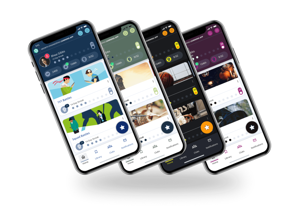
THE ULTIMATE MOBILE LEARNING EXPERIENCE ON GROWTH ENGINEERING LEARNING APP
Want to increase your content completion rates by up to 230%? Growth Engineering Learning App places unlimited potential right where your learners need it — in their pockets!
2. Be Consistent
One way to make sure the little niggly details aren’t overlooked is to be consistent. Pick your preferred style and stick with it – that way you won’t need to think about it each time.
For example, decide whether you want to tell learners to ‘Click here to go to the next slide’ or just provide a clickable arrow to do the same. Once you’ve decided, use that format throughout the eLearning module. Not only does it make your job easier and allow you to think about other, more important things, but it makes the learning journey less confusing for learners, too.
Additionally, ensure that your content is released on a consistent time and on a consistent date and in a consistent place. This will, a) save learners having to search around for it and b) installs a learning expectation.
Maybe you tune into the 8am news every morning? You know it’s always going to be there at 8am, and well, so are you! The same goes with eLearning. Give your learners a learning structure! (Hopefully you’ll make it more entertaining than the news).
3. Think Like a Learner

To really create great eLearning, you need to get under the skin of a learner and think like they do. If you were taking the eLearning module, what would you like to see?
How much would you care about the colour of the title, or the size of the ‘Next’ arrow? Is it really important that every image is square? Once you begin to think like a learner, you’ll discover which details are really important – and which are barely noticed.
Striking the correct balance of attention to detail versus working efficiently can be tricky, but once achieved you’ll find the quality of your eLearning increases tremendously.
Our learning solutions allow you, the admin, to personalise your own platform. From your colour schemes to your own banners and logo; you can really make your learners feel at home.
Final Words
eLearning isn’t a piece of cake. It’s not just a case of uploading, sitting back and hoping for the best. A large part of any efficient eLearning campaign in the preplanning that goes into it. If you make a checklist of essentials, be consistent in your formatting and releases, and if you think like a learner, you’ll be halfway there!
Want to learn more about what it takes to create great eLearning? We just wrote a white paper on it! Download it here!

